Content + web development.
Marketing an insurance broker… pretty straight forward hey? Wrong!
We love the challenge of identifying a business' point of difference - no matter the industry. Before we come up with any campaign we set out to gain an understanding of the business as a whole, ensuring that we are talking to the right people, using the right tone of voice and making sure that every touchpoint is completely on-brand.
Our brand and marketing team did what they're great at, and unearthed exactly what it is that makes Mckillops Insurance Brokers stand out from the crowd.
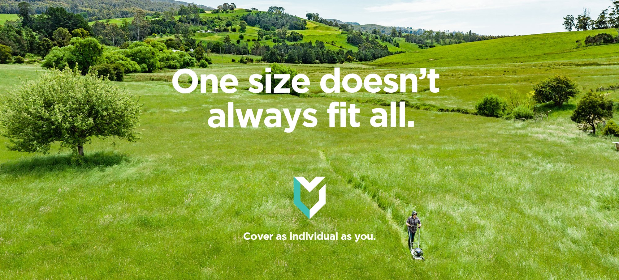
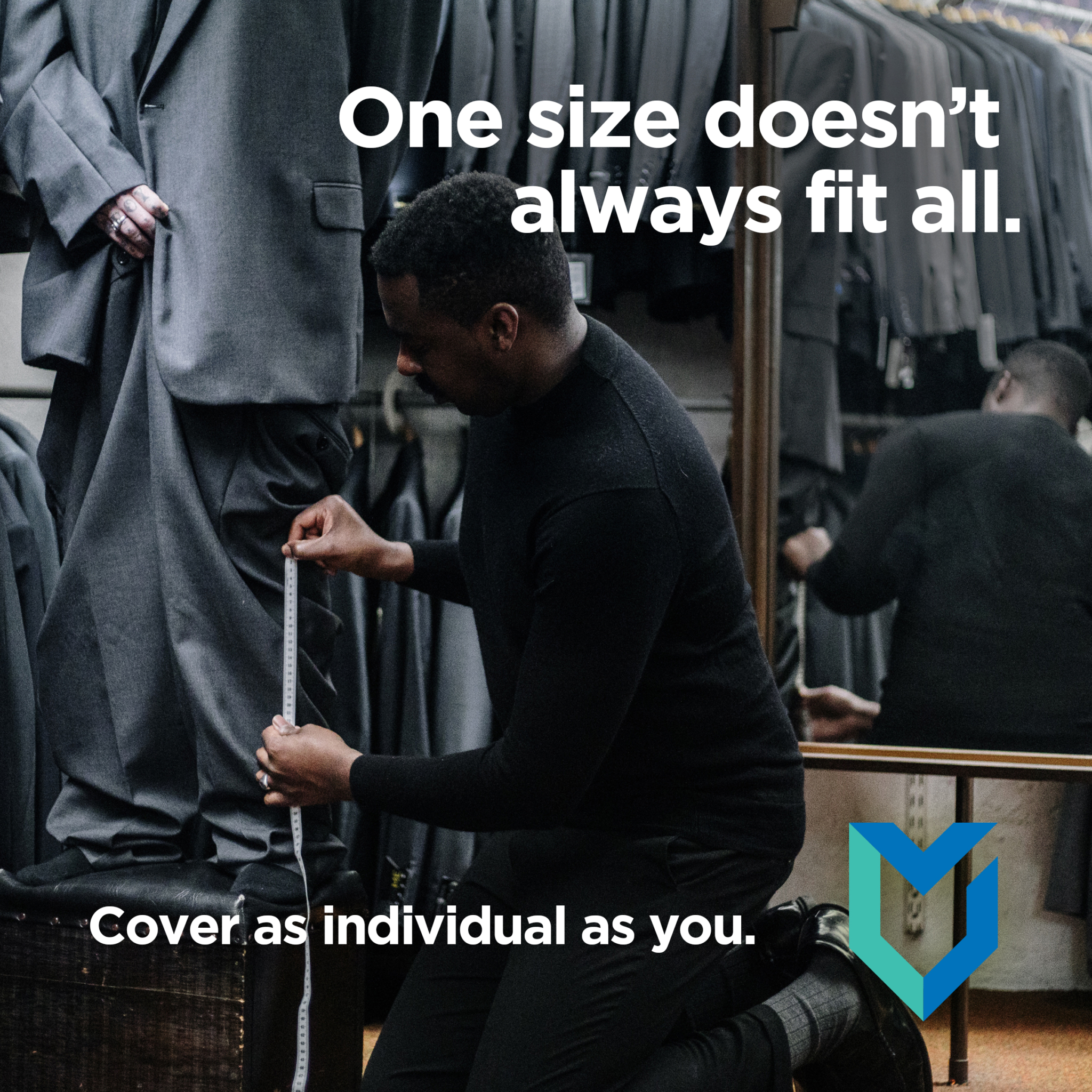
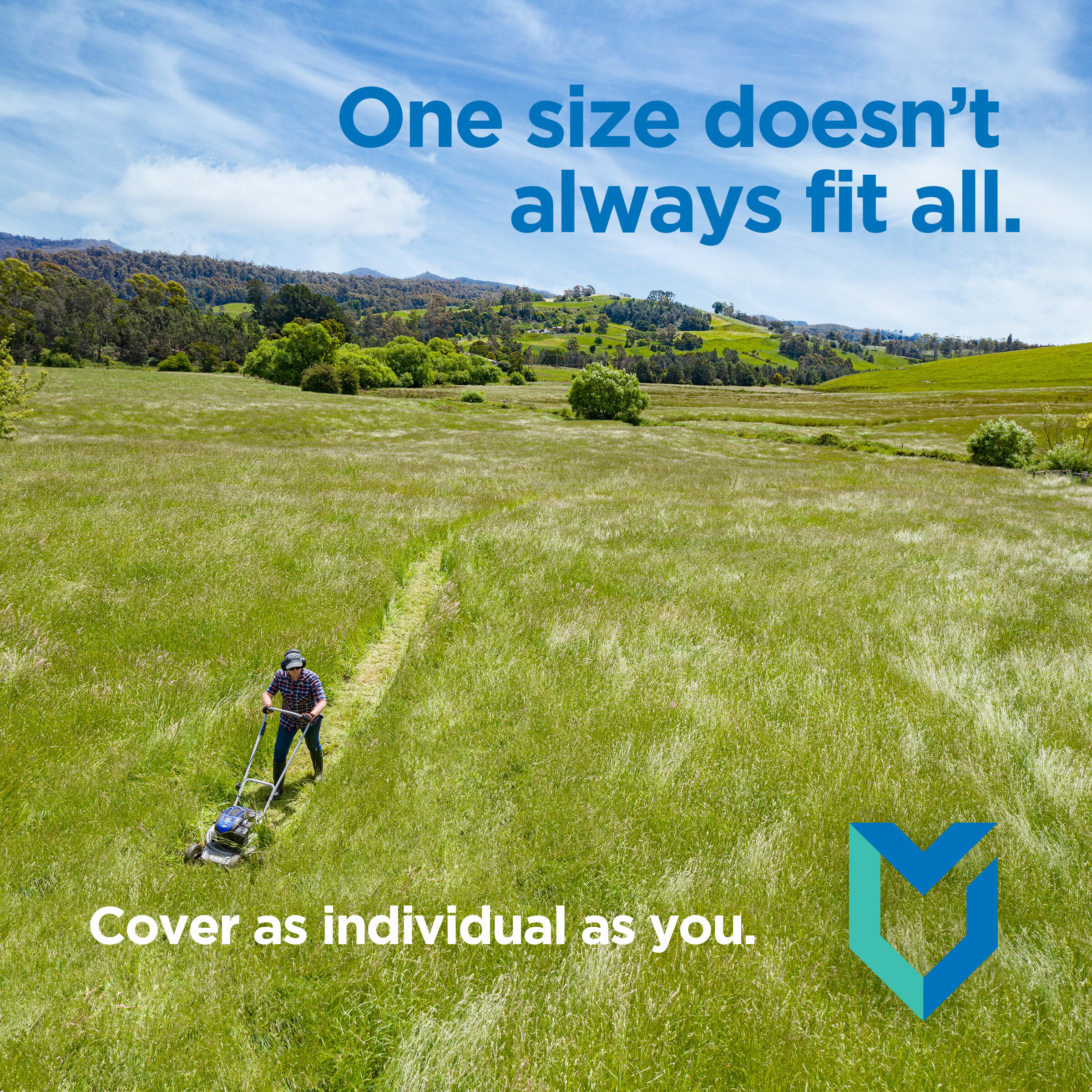
After identifying their point of difference as being the customised and individual approach they take for each and every client, we then went about coming up with a creative campaign that promoted this in a memorable way... (You can probably tell that our team had a lot of fun with this one!).
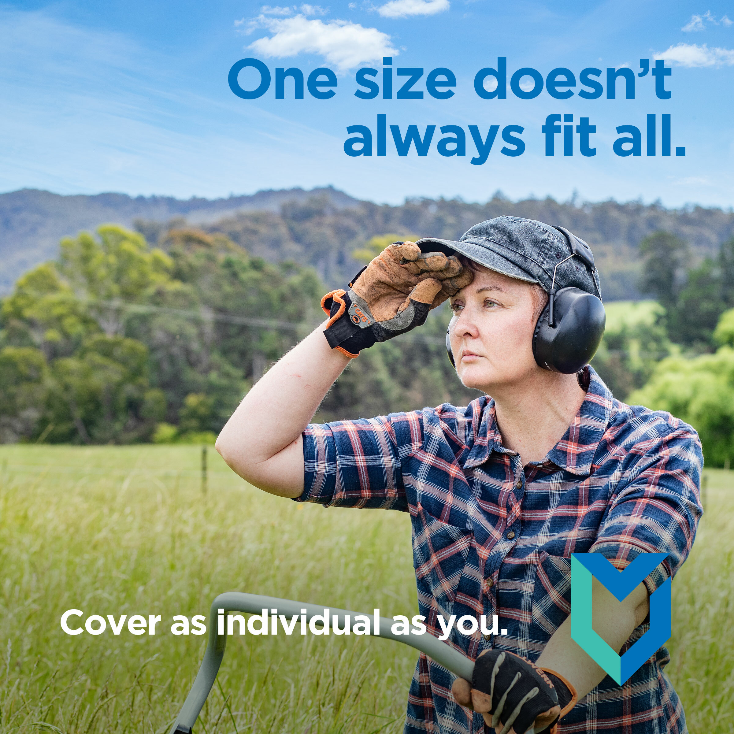
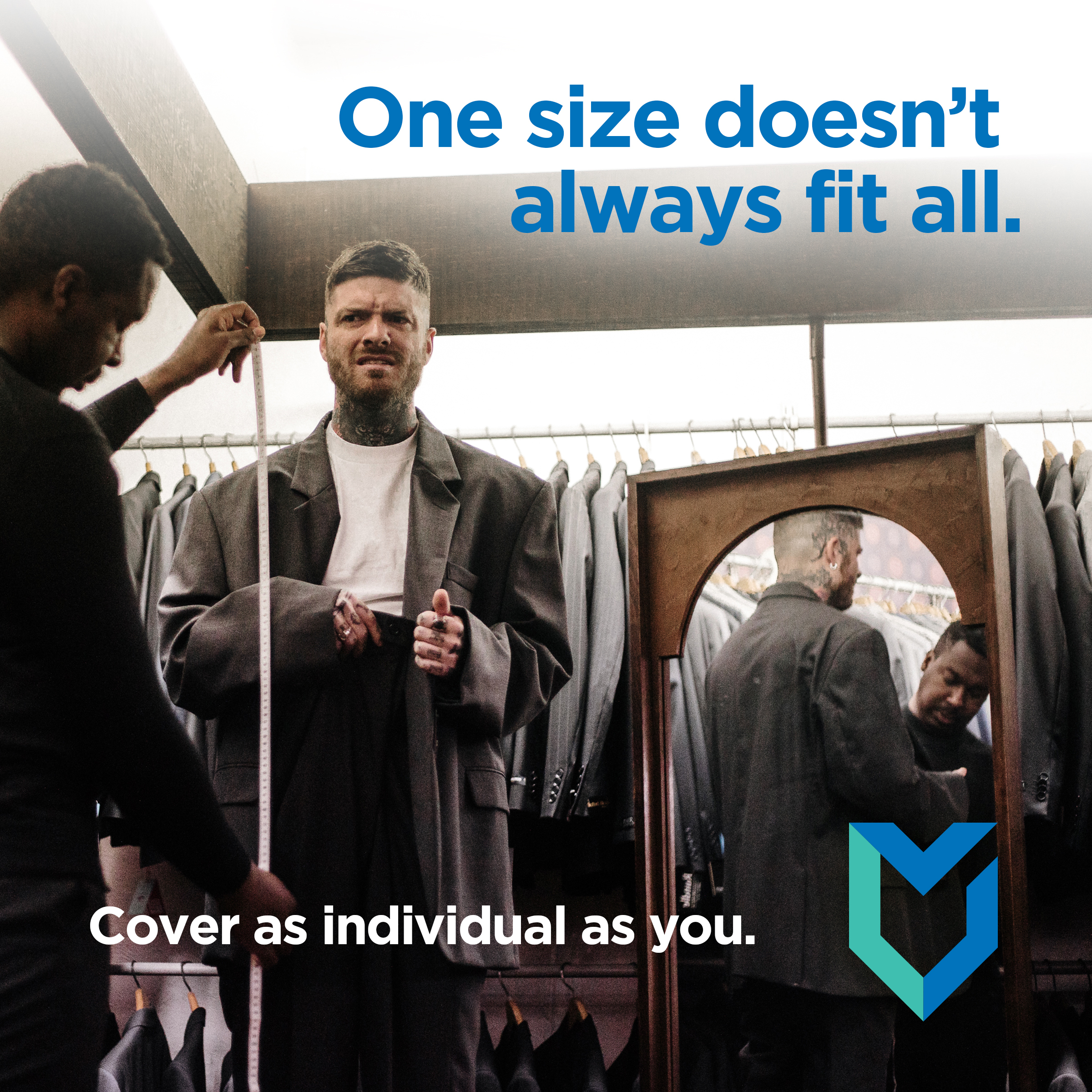
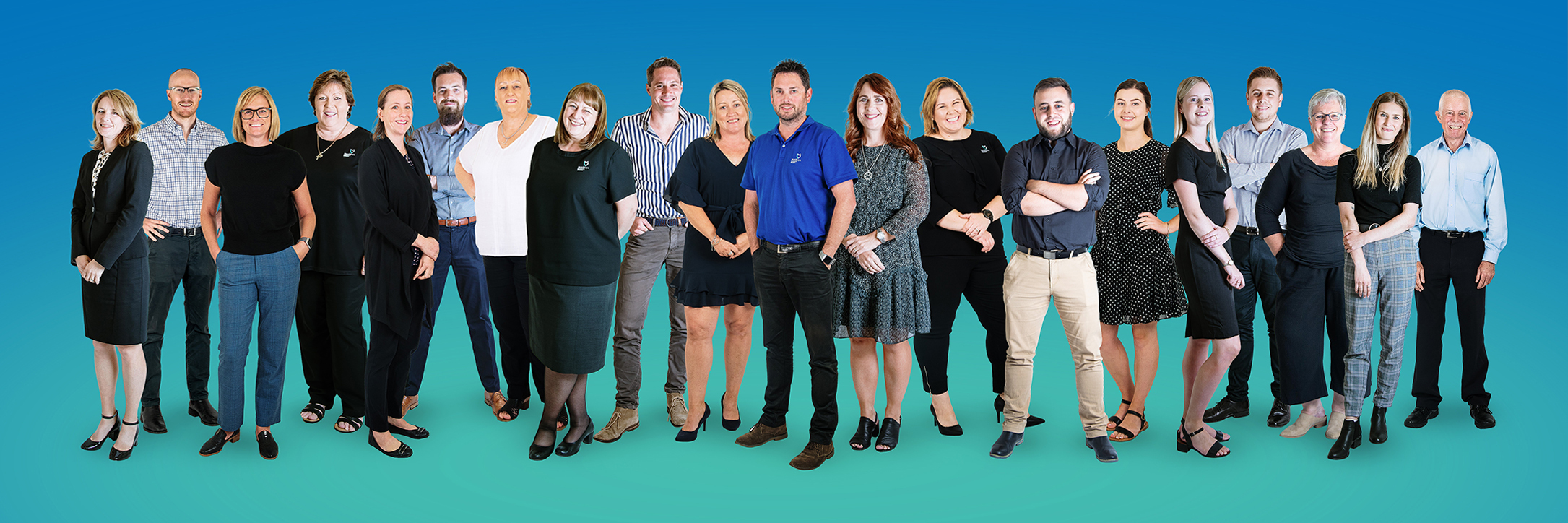
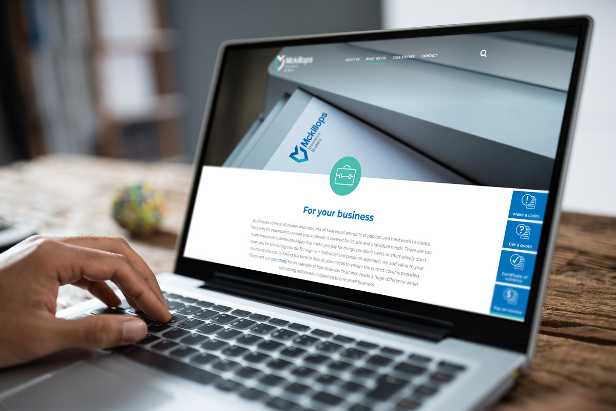
Website design isn't all about making something look great (though that is always an end result!). It's important that we fully understand the audience who are using the website, and what they're using it for. For Mckillops, through research and client experience we came to understand that the majority of their clients access the website on their mobiles, and need easy access to some very specific forms... so this was kept top of mind when our team came to the design and usability.
The end result is a website that is fresh, on-brand and feels almost 'app-like' when viewed on a phone - giving users an experience that is functional, informative and has easy access to quotes, payments and forms.
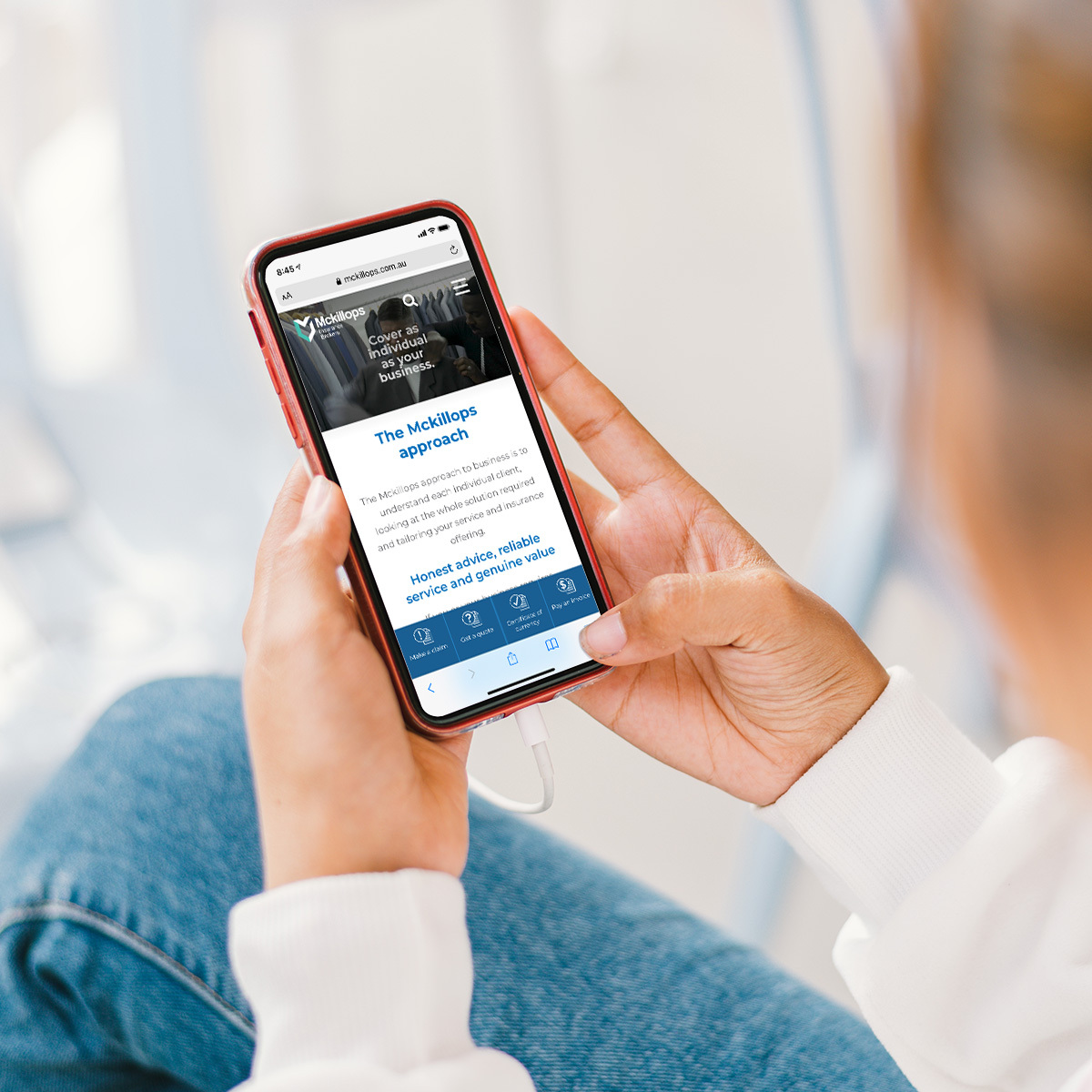
Just like their campaign states, Mckillops treat everyone as an individual - whether it be a client or their own staff. That’s why when it came to their headshots, we made sure each individual added a personal touch to theirs.
Once our photographer had taken the 'official' headshots for each staff member, we asked them to add to it, with drawings about the things that are important to them. The result is a team page on the website which is a little different, has a lot of personality and is individual to each staff member.
Whether it be a big or a little thing, it’s important that there is consistency in your branding. Our brand and marketing team love finding what makes each business different and putting our heads together to create a long-lasting campaign, website, brand or even staff photos to further enhance it.
Client
Location
- Launceston
Discipline
Project Team
- Monica Plunkett
- Rain Lyall
- Richard Grantham
- Ashlee Carey
- Richard Harmey
- Mahala Cohen
Related posts
Get Started
Let's work together...
Interested in how we can help your next project be next level wonderful? Whether you’re looking at building your dream home (or renovating your existing one), have a business development in mind, or you’re in need of some help with brand and marketing (and all that this encompasses), let’s talk about how we can work together to create some magic!
