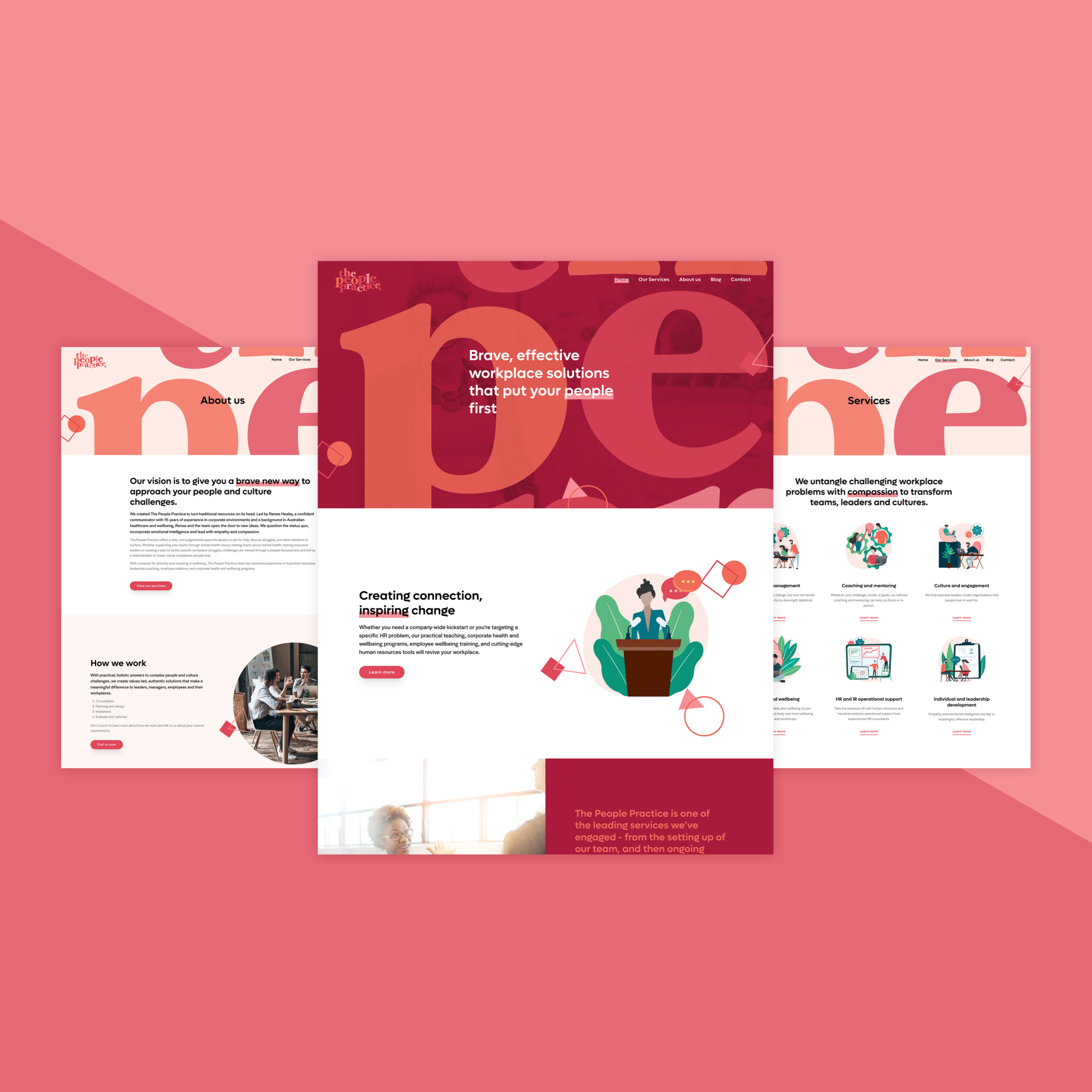
Brand, web + collateral.
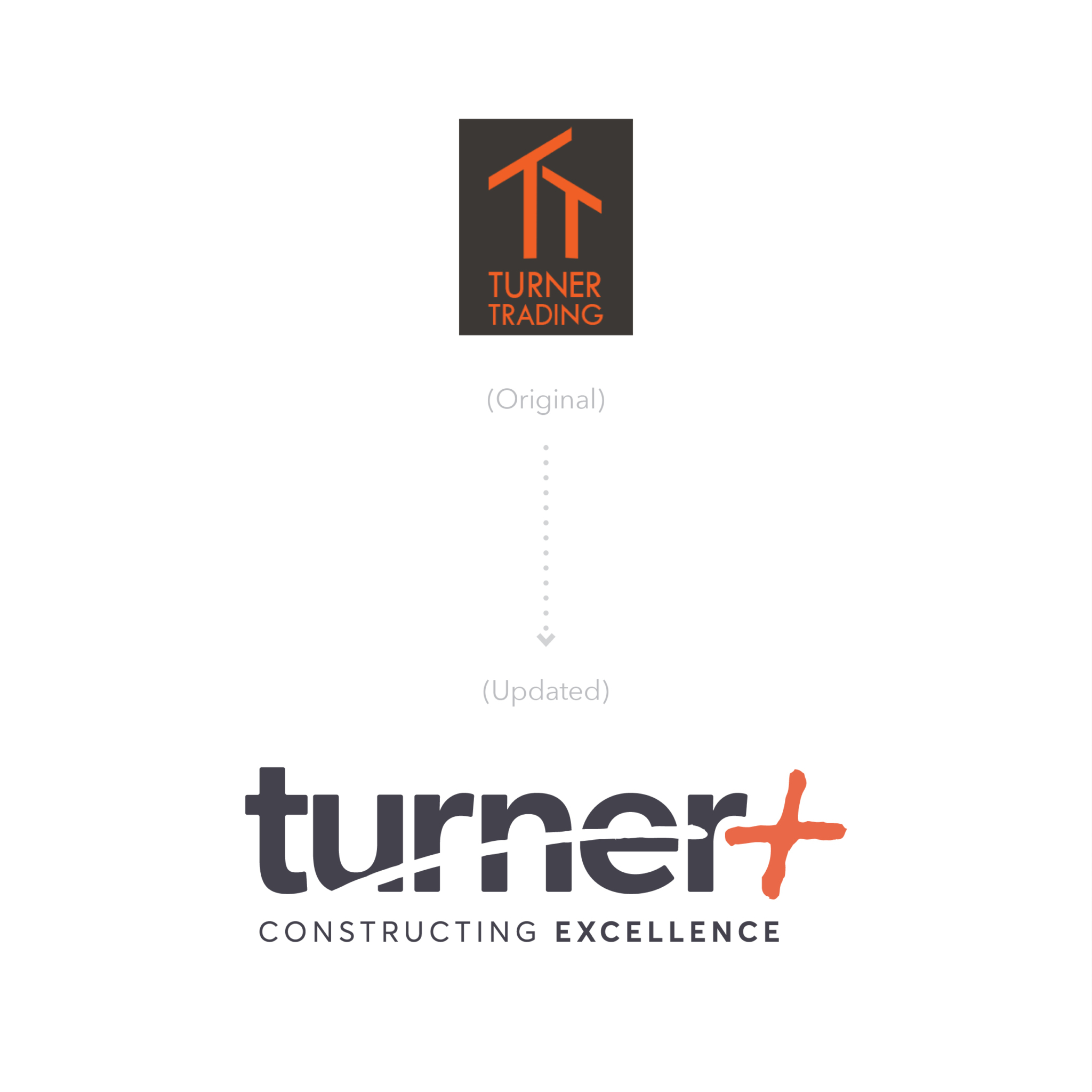
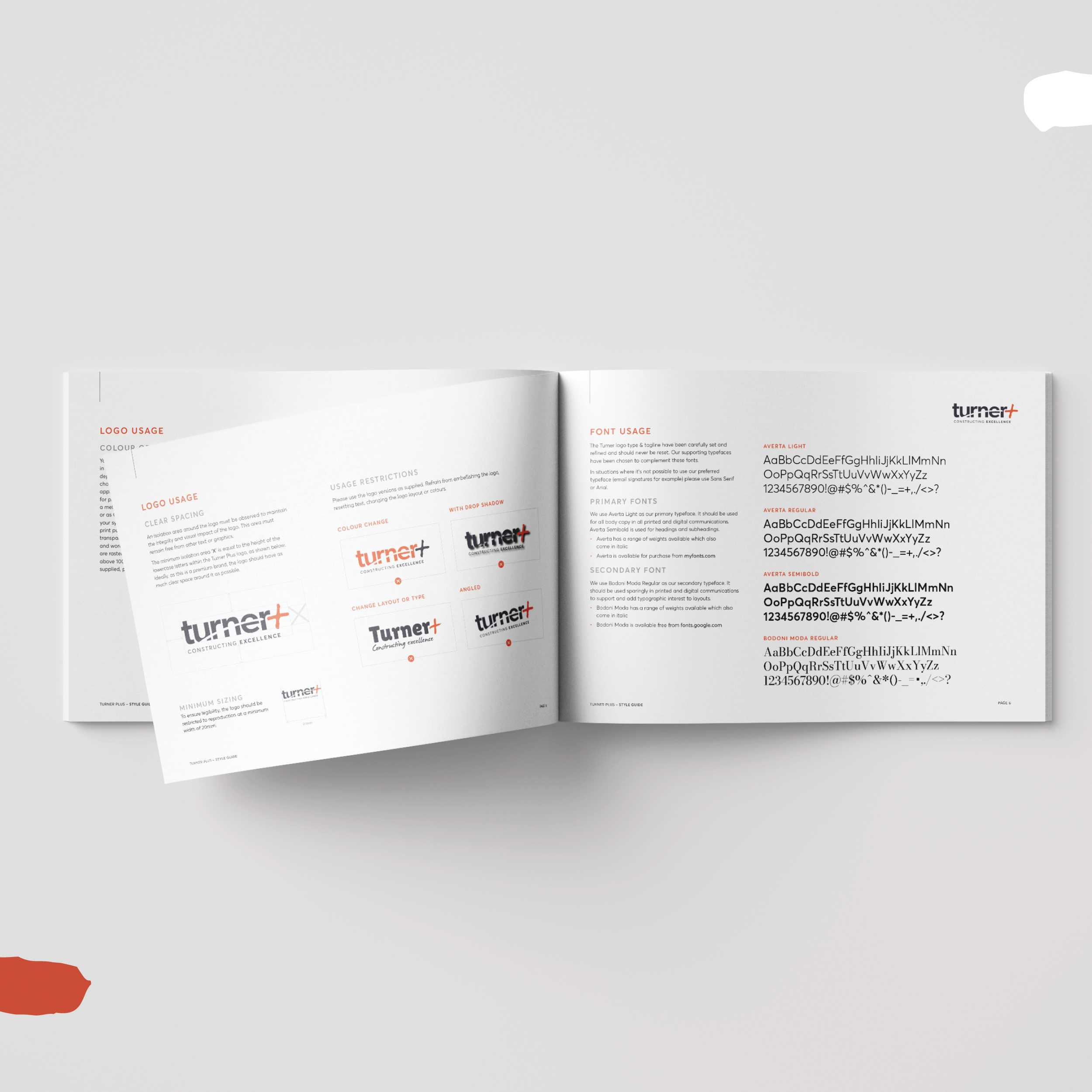
When North West Coast builders Turner Trading came to us for brand help, the first stop was a workshop and strategy. This helped us determine that their name, ‘Turner Trading’, was a little misleading, and it certainly didn’t reflect the high quality builds and renovations they deliver… A few brainstorms and creative sessions late, and Turner Plus was born.
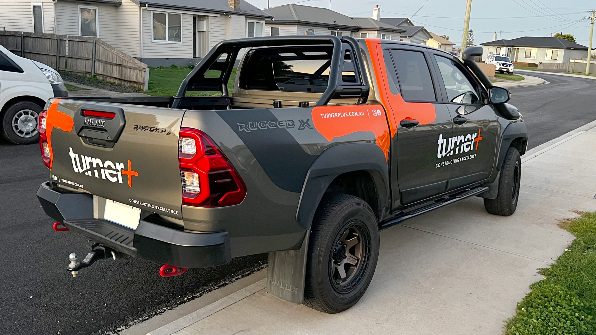
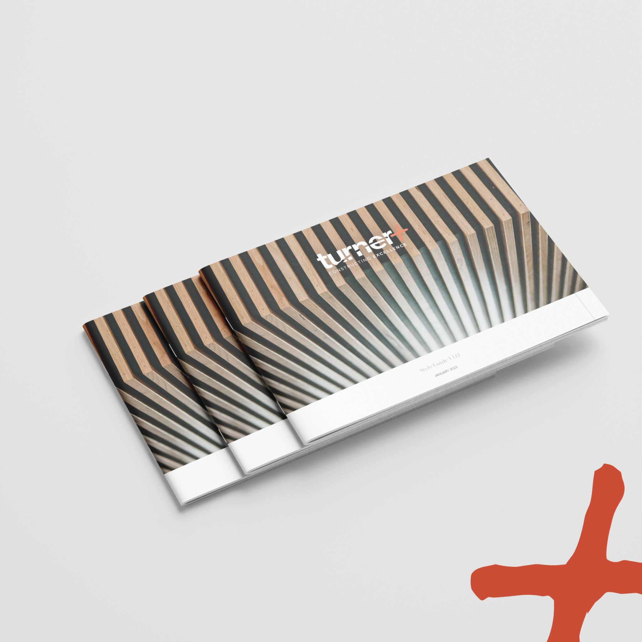
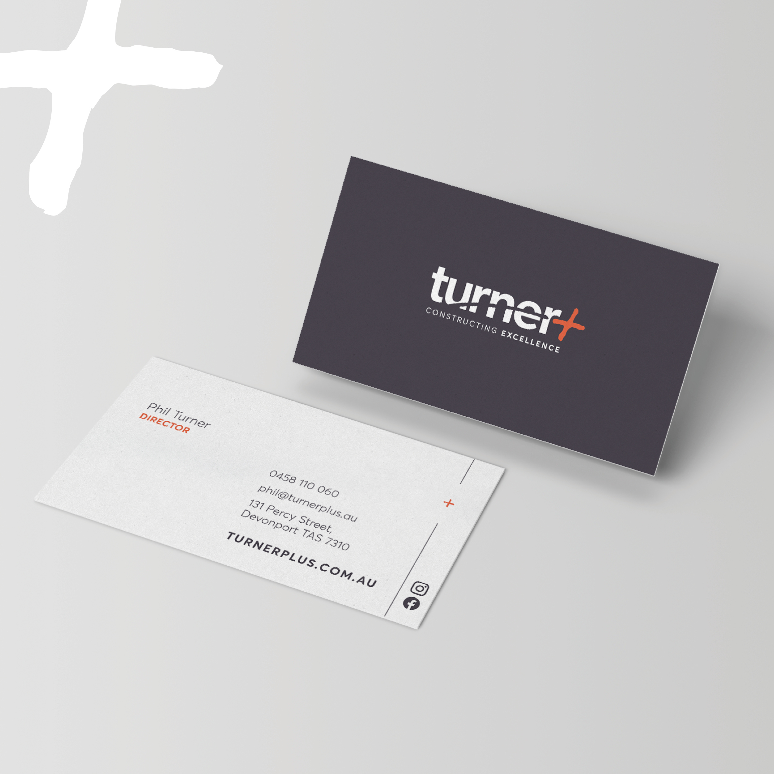
From a style guide that helps all touchpoints stay consistent to stationery and vehicle signage... If you’re on the North West Coast of Tassie, keep an eye out for the new Turner Plus brand, coming to a building site near you soon!
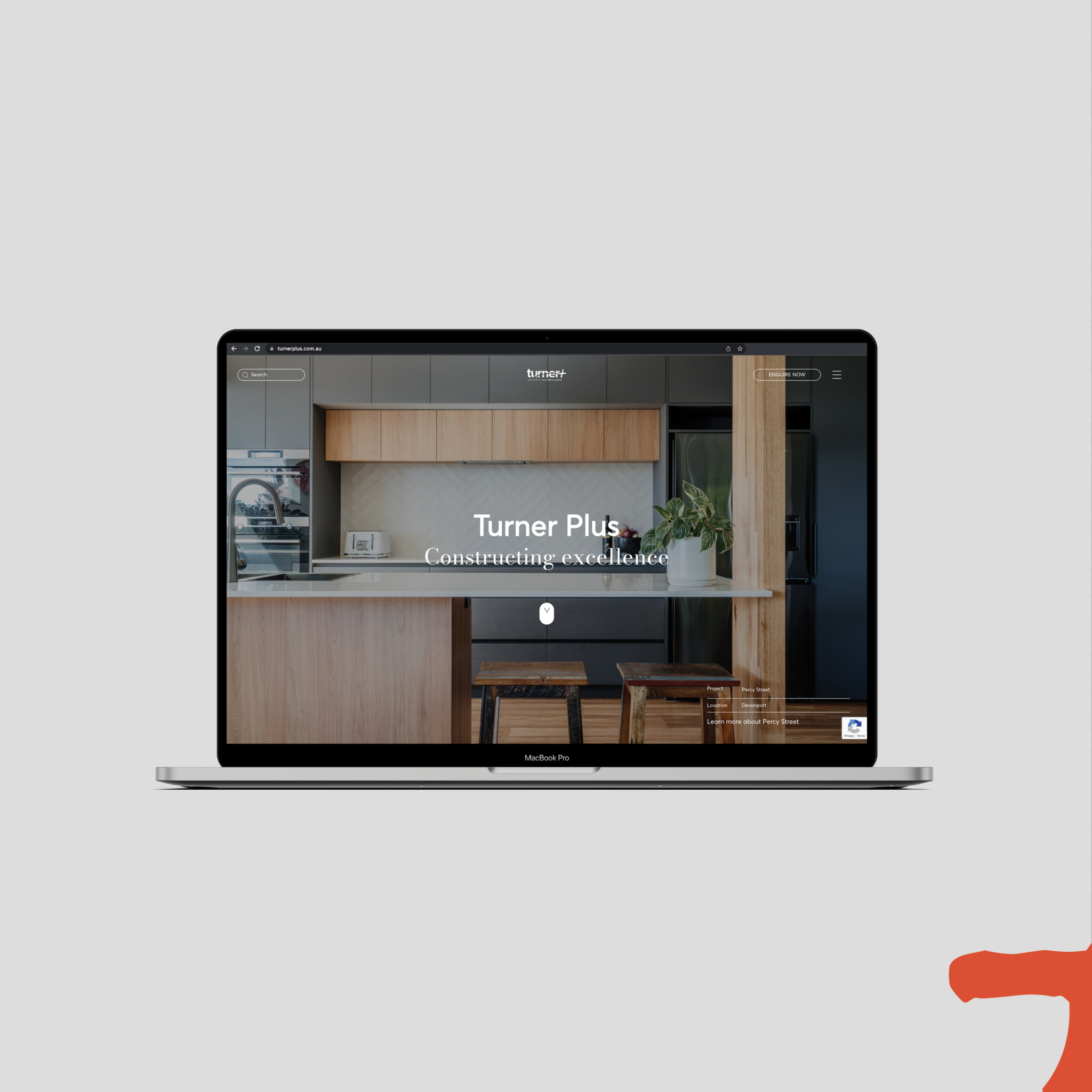
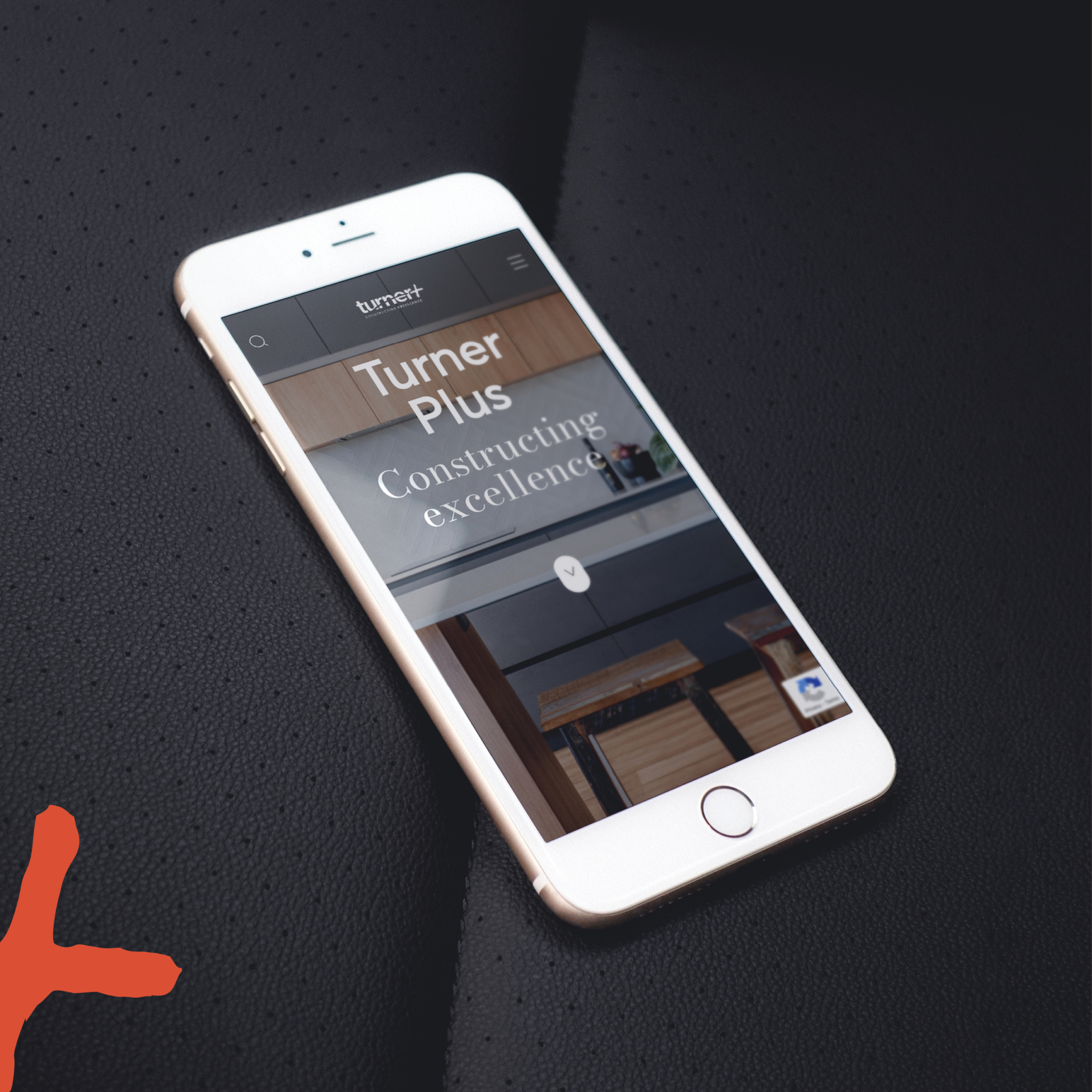
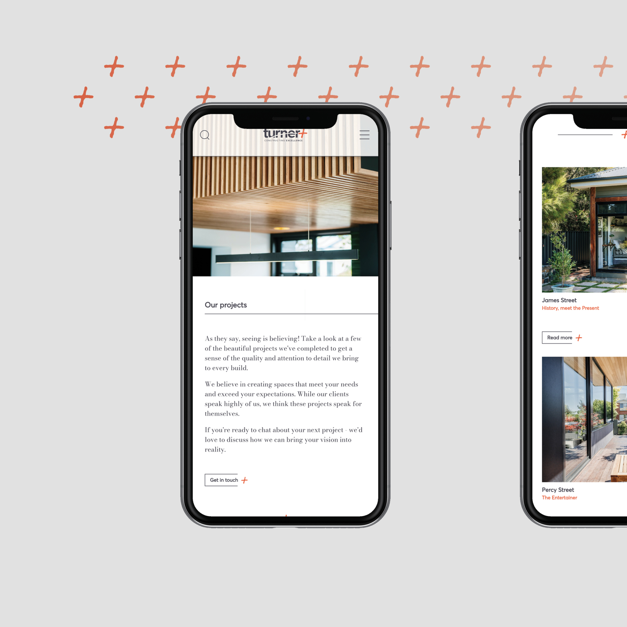
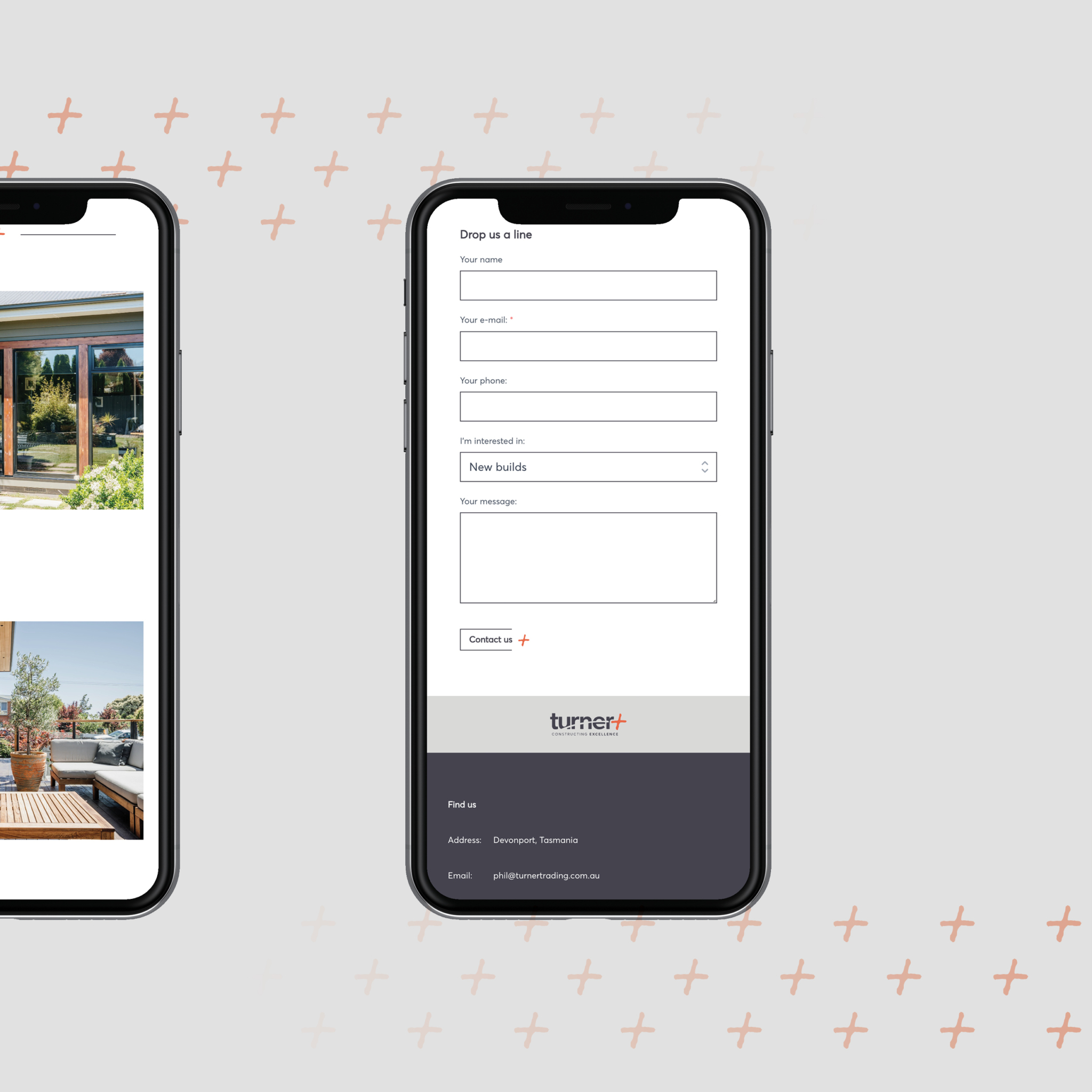
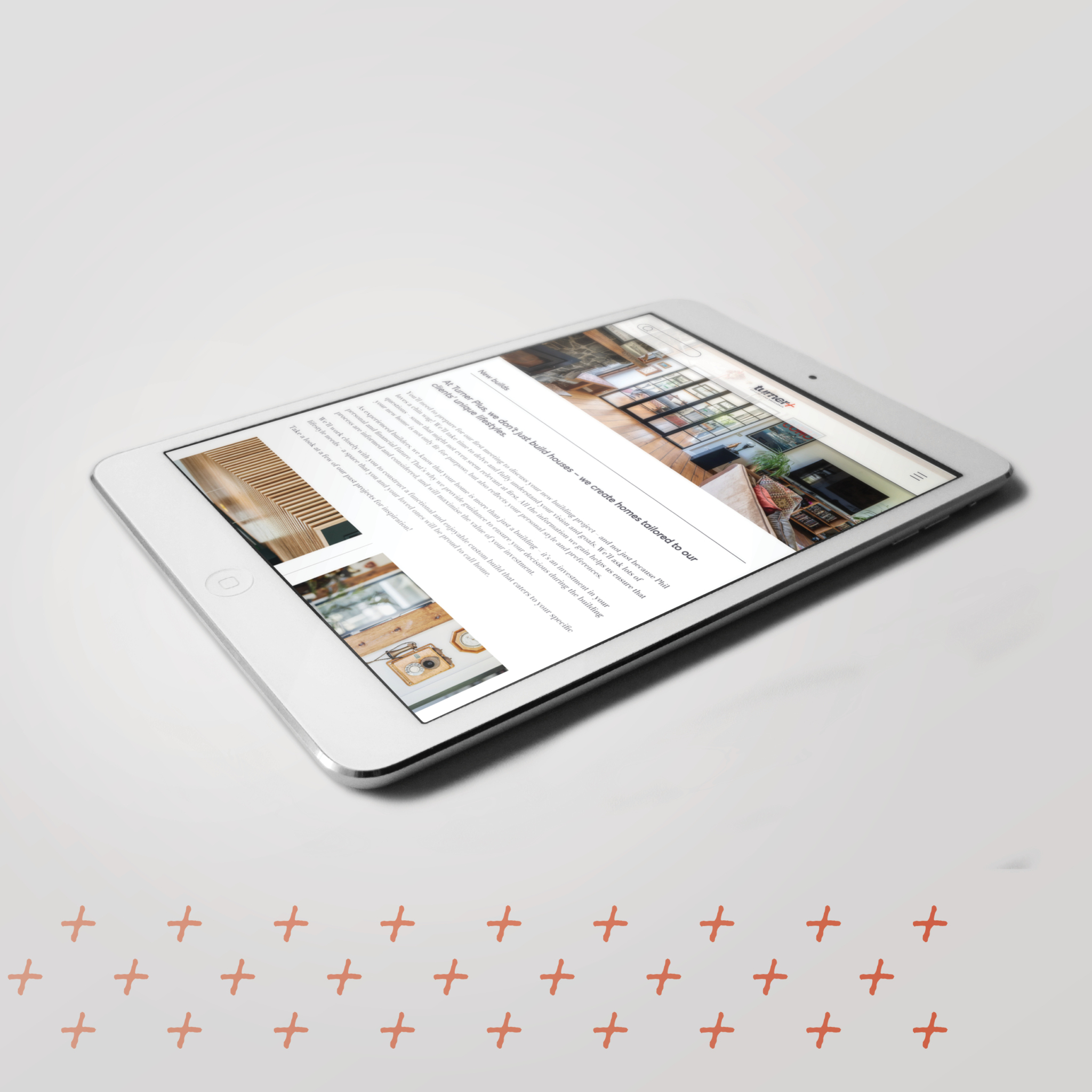
The new Turner Plus website is designed to portray a building company that’s a little different to most – it’s all about high-quality outcomes, carefully considered aesthetics and very satisfied clients. This is exactly what has been portrayed through the design of the Turner Plus website.
A well-designed website is visually appealing, organised, and easy on the eyes. It captivates your audience and keeps them engaged. When your website looks professional and polished, it not only reflects positively on your brand but also instils a sense of trust and credibility in your visitors. They'll feel confident in doing business with you and will be more likely to stick around and explore what you have to offer.
Client
Project Team
- Monica Plunkett
- Rain Lyall
- Harsha Herath
- Leah Bell
Related posts
Get Started
Let's work together...
Interested in how we can help your next project be next level wonderful? Whether you’re looking at building your dream home (or renovating your existing one), have a business development in mind, or you’re in need of some help with brand and marketing (and all that this encompasses), let’s talk about how we can work together to create some magic!
